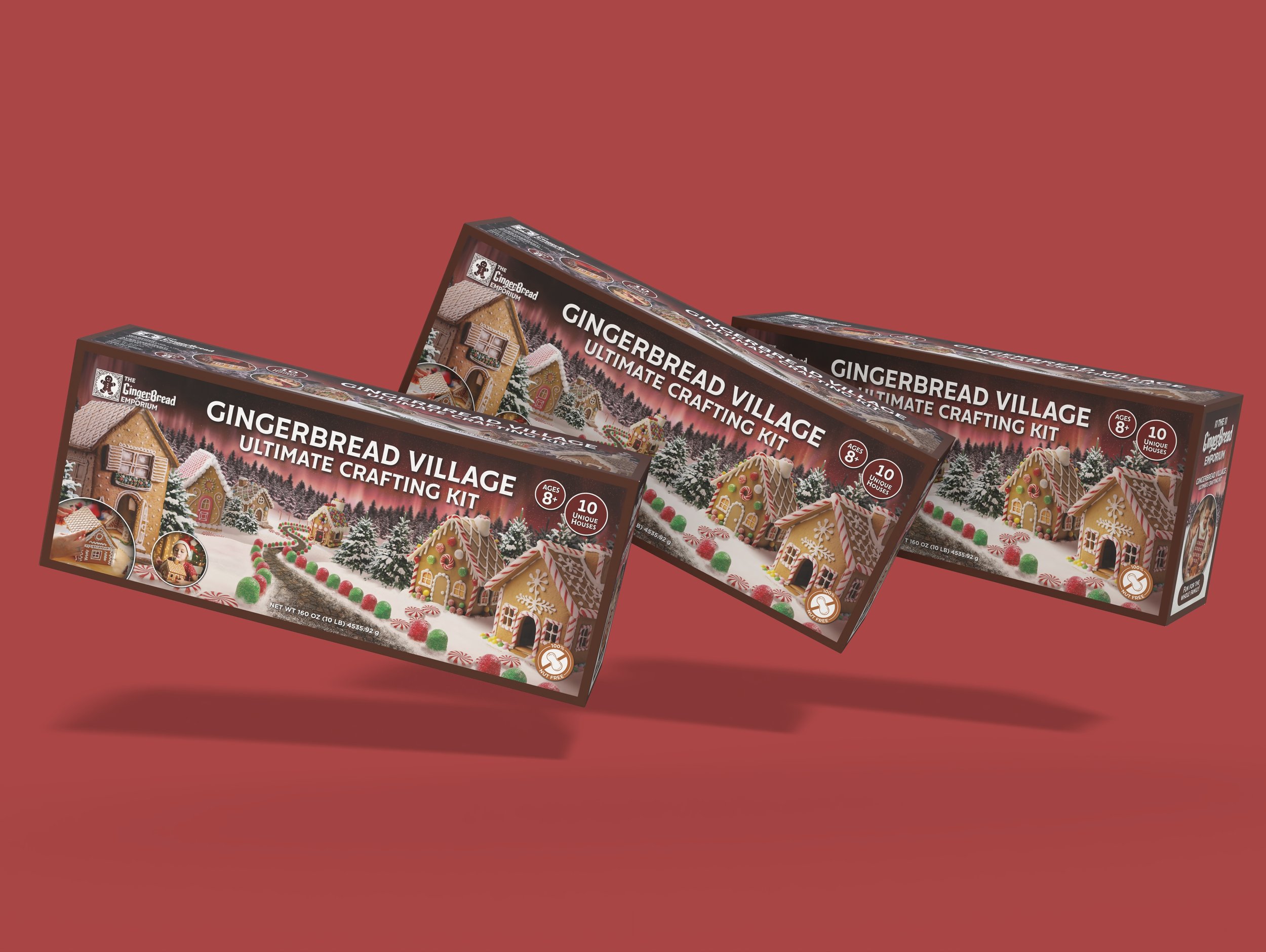
The Gingerbread Emporium
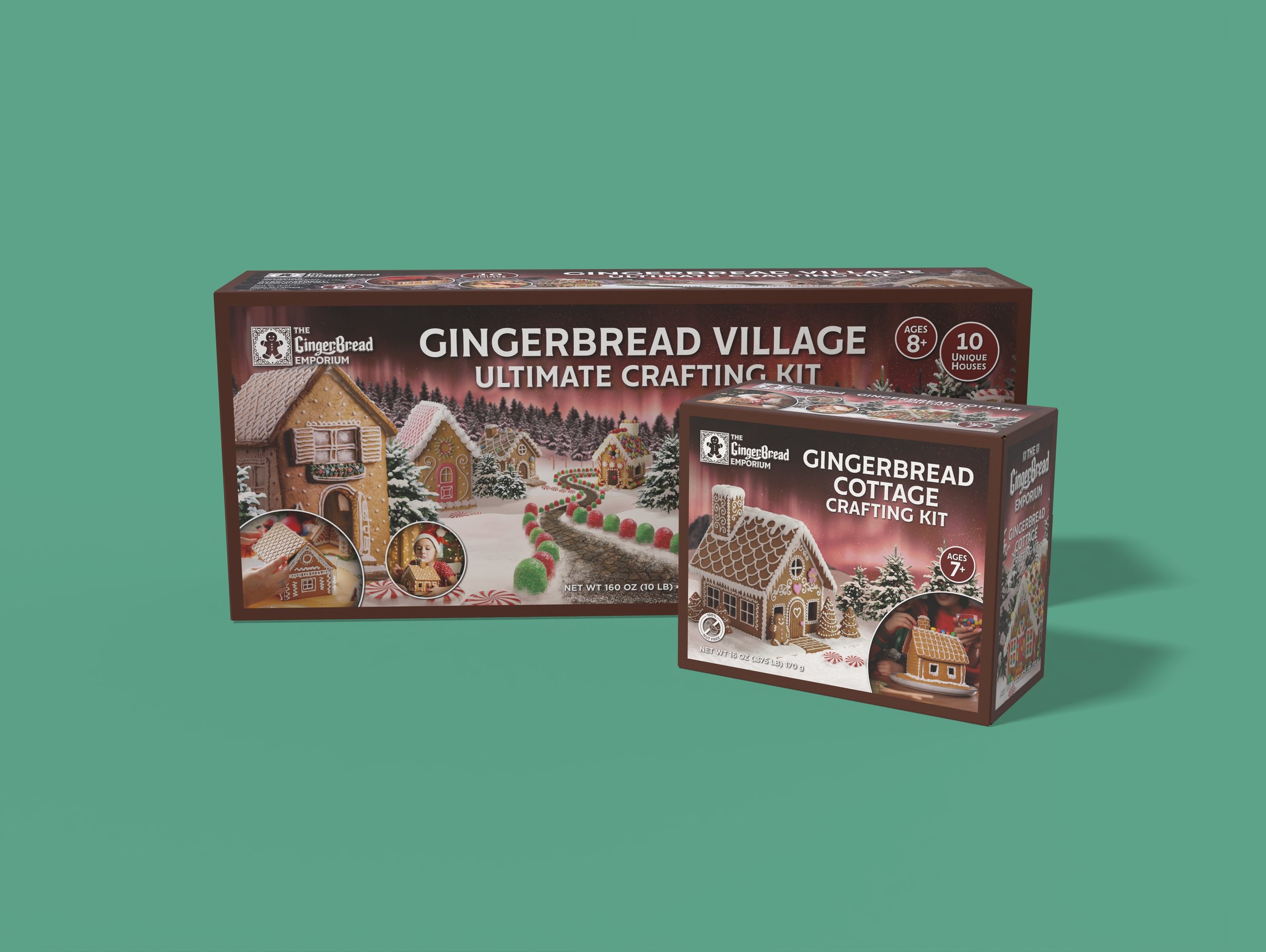
The Gingerbread Emporium is my 2026, semi annual Christmas themed design project, focused on establishing a packaging design framework for high quality gingerbread house crafting kits. This project included branding development but primarily focused on packaging, resulting in examples of both a small, single house kit, and a large, multi house kit to demonstrate the brand in two different scales and establish consistency for future kits.
The Gingerbread Emporium is a brand belonging to NP Industries, Inc., located in Arctic Bay in the northernmost reaches of Canada, with most retail chains stocking the kits located in North America, France, and the United Kingdom. The boxes are designed with French and English speakers in mind, and are suitable for anyone above the age of four to decorate and experience holiday whimsy.
Visual Identity
The first design challenge was to ascertain what design trends and similarities exist between competitor products and determine how the kits will stand out compared to all the rest as the primary choice for this beloved holiday tradition.
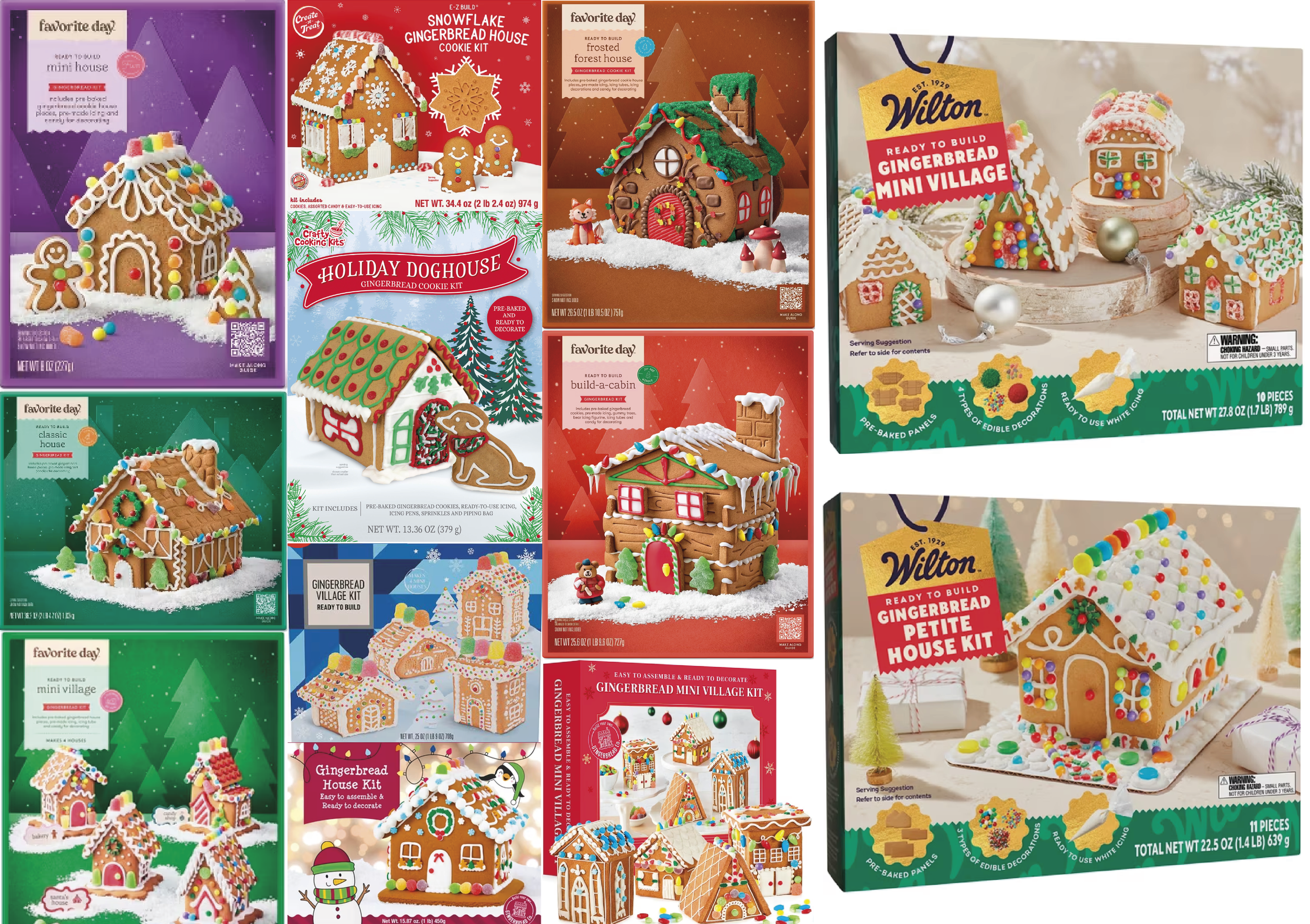
The competitor brands demonstrate a striking lack of individuality, with an emphasis on simplistic, monochromatic backgrounds with stark, isolated examples of the houses included in the kits. Overall, competitor brands demonstrate a style reminiscent to early 2000’s clip-art.
The Gingerbread Emporium aims to deliver a far more engaging packaging style that takes the consumer into complex, whimsical scenery where the example houses are integrated into semi-realistic looking environments rather than placed in isolated form in the front and center of the box.
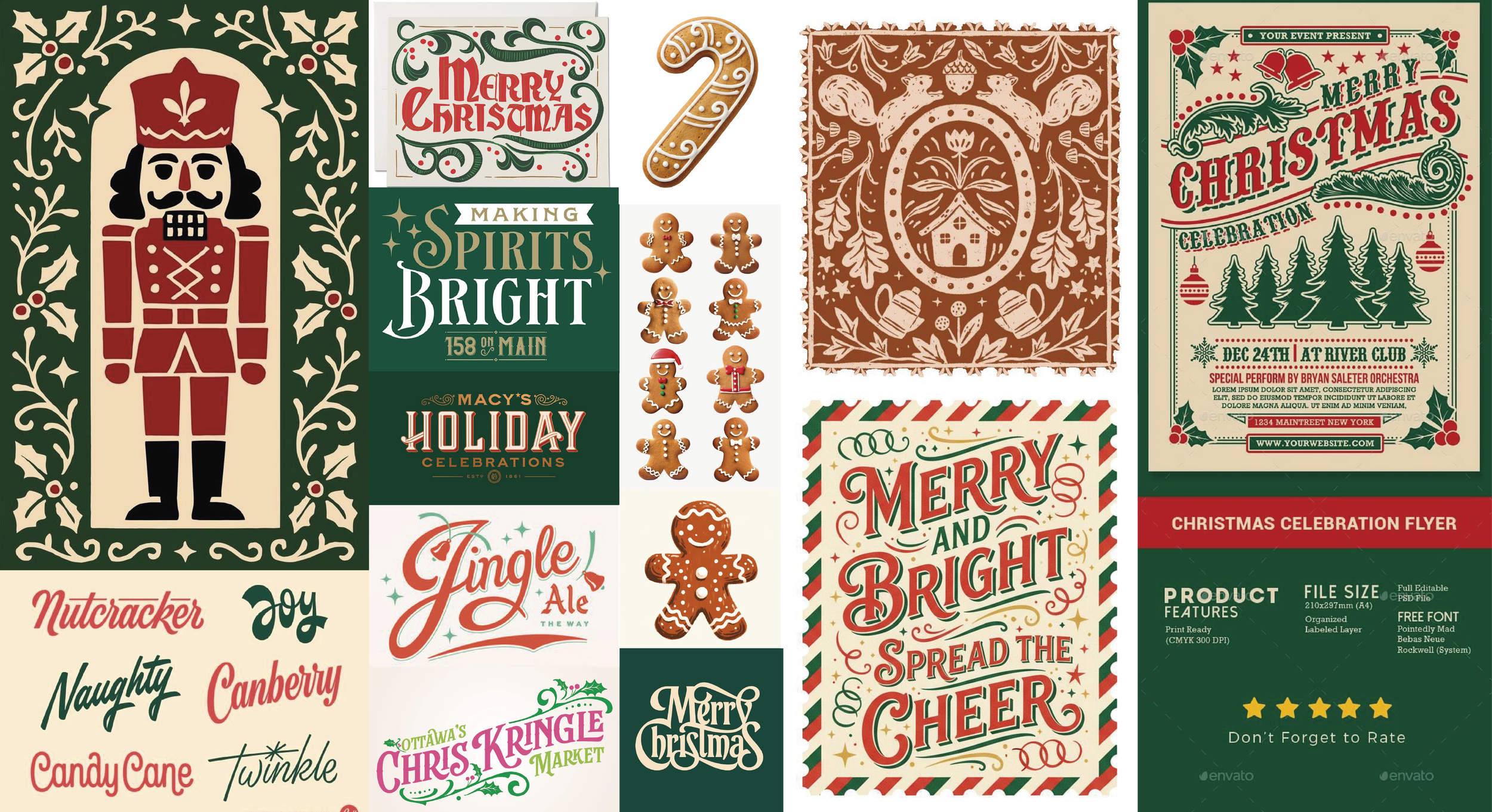
Additionally, the logo family aims to present a nostalgic feeling with an elegant and refined look present in pre-2000’s branding and Christmas themed lettermarks and advertising materials. I was additionally inspired by designs with flourishes and frames that would add to the traditional look.
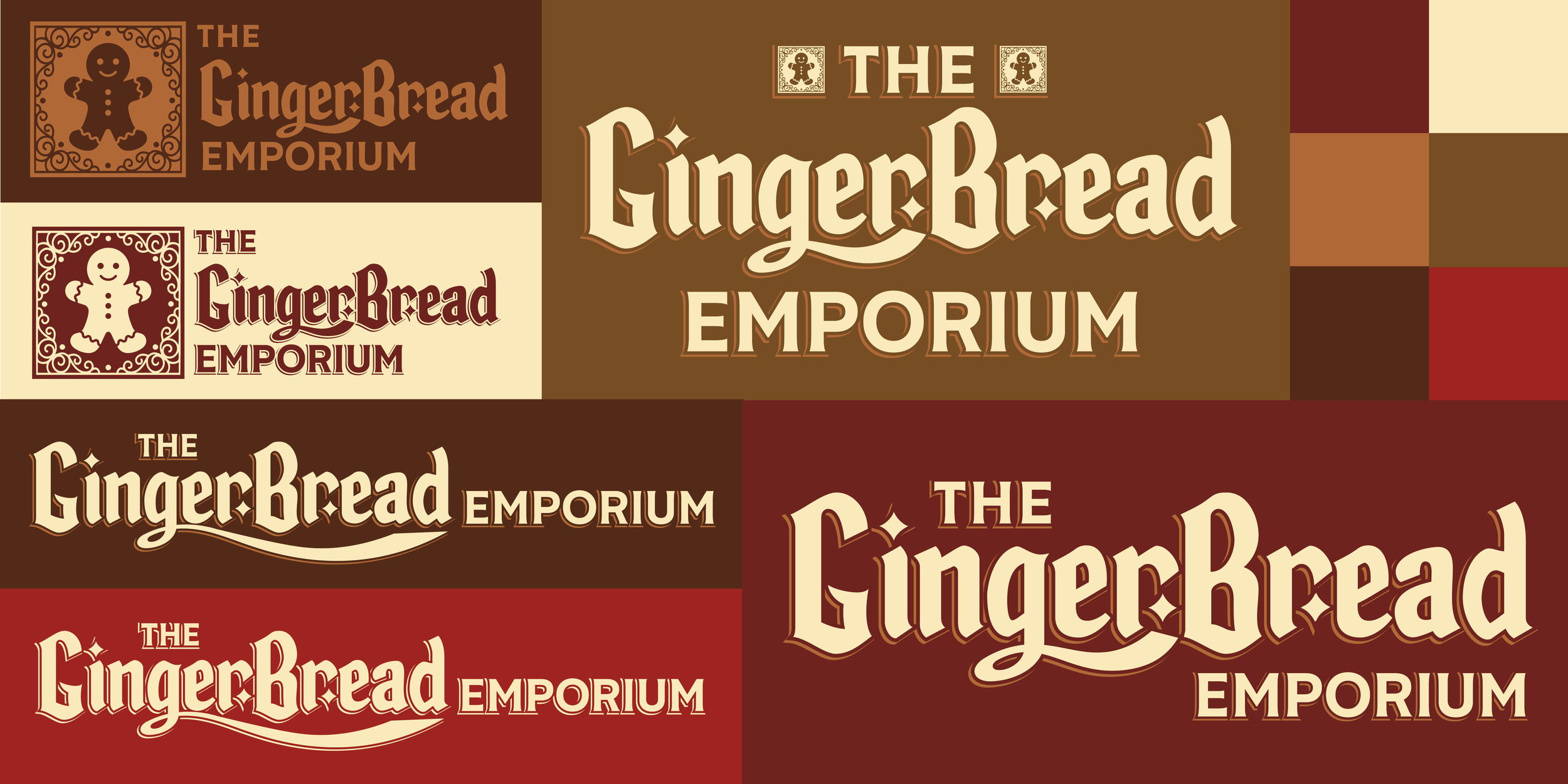
With this inspiration in mind, four logo variants were developed alongside a brown, cream, and red color palette to tie more closely to the gingerbread theme of the product line.

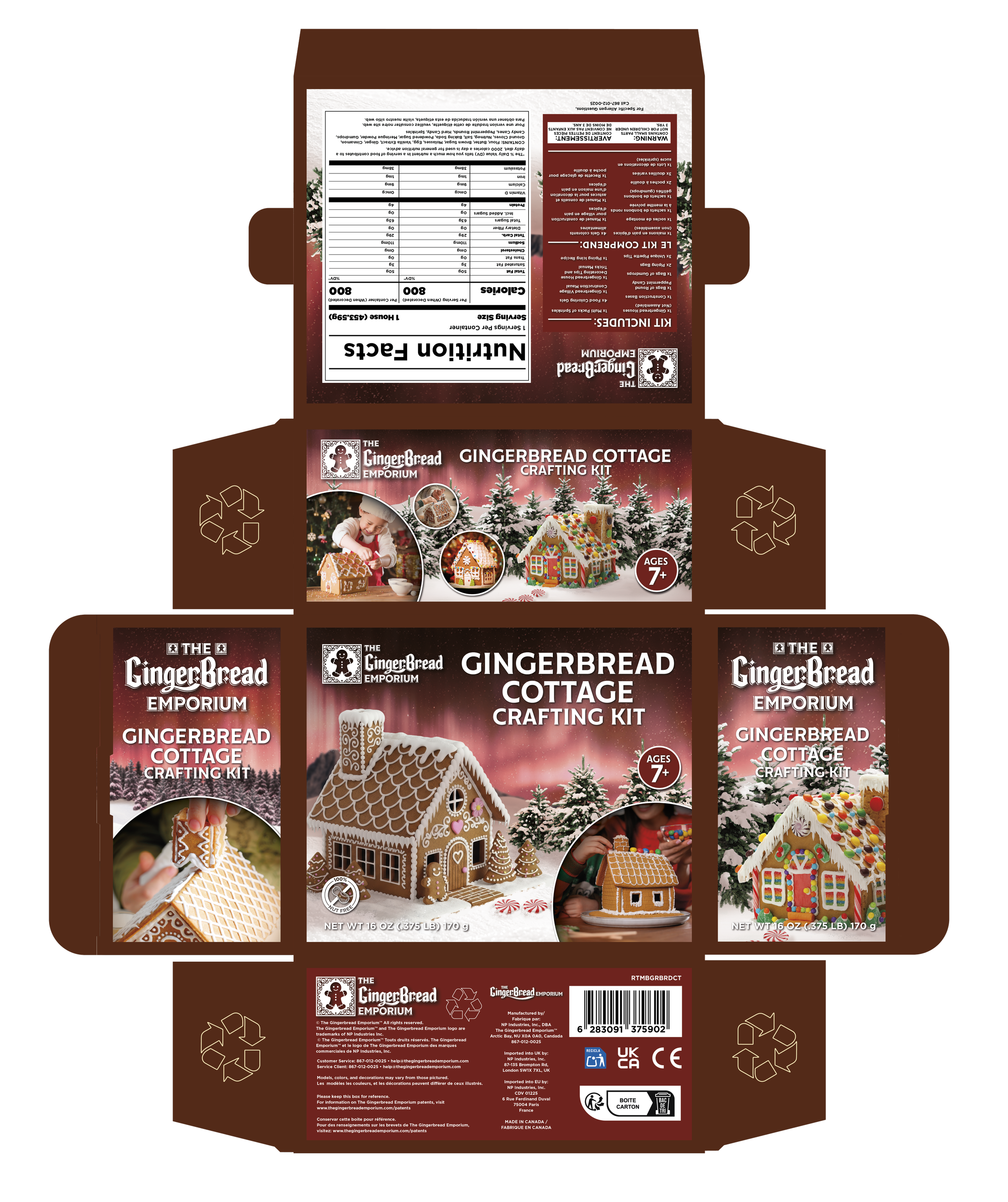
Once the overall brand had been established, it was time to dive into the real purpose of this project - the packaging. Referencing die-lines from toy companies and ready to make dessert boxes, I began with a general skeleton for two different box sizes, and built out the packaging framework from there. The wider die-line is for a 22”9"x”5.25” box, and the smaller die-line is for a 11”x9”x5.25” box.
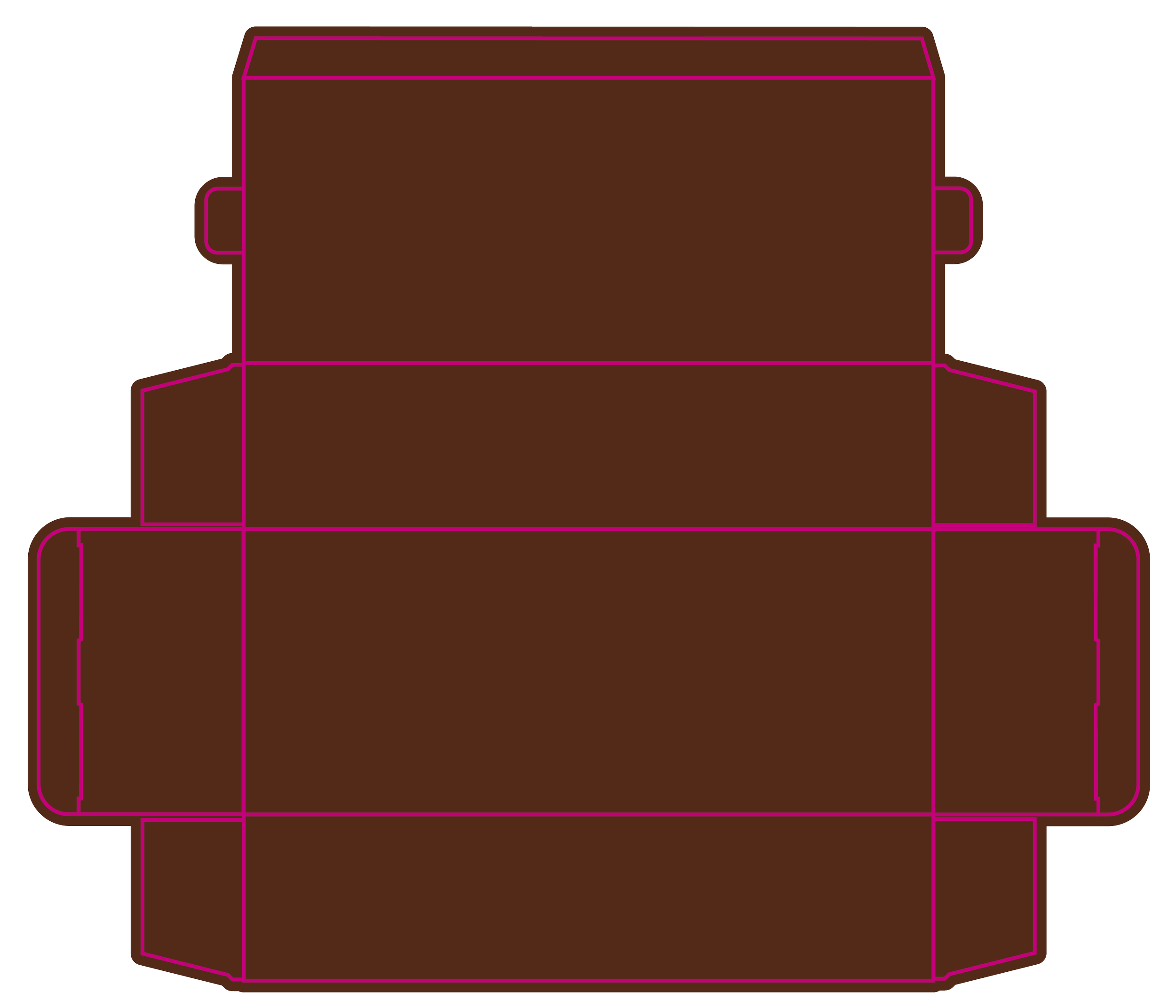
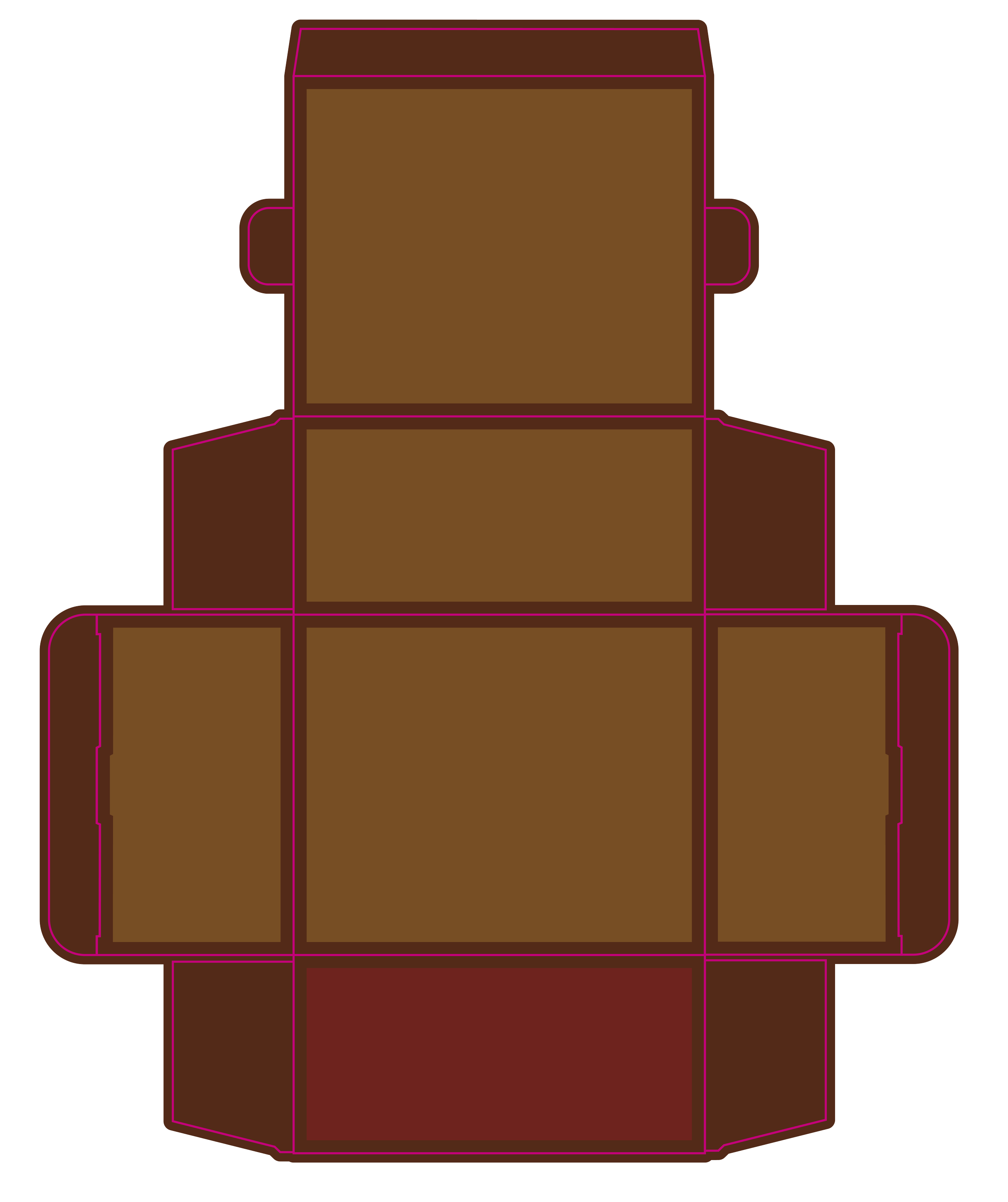
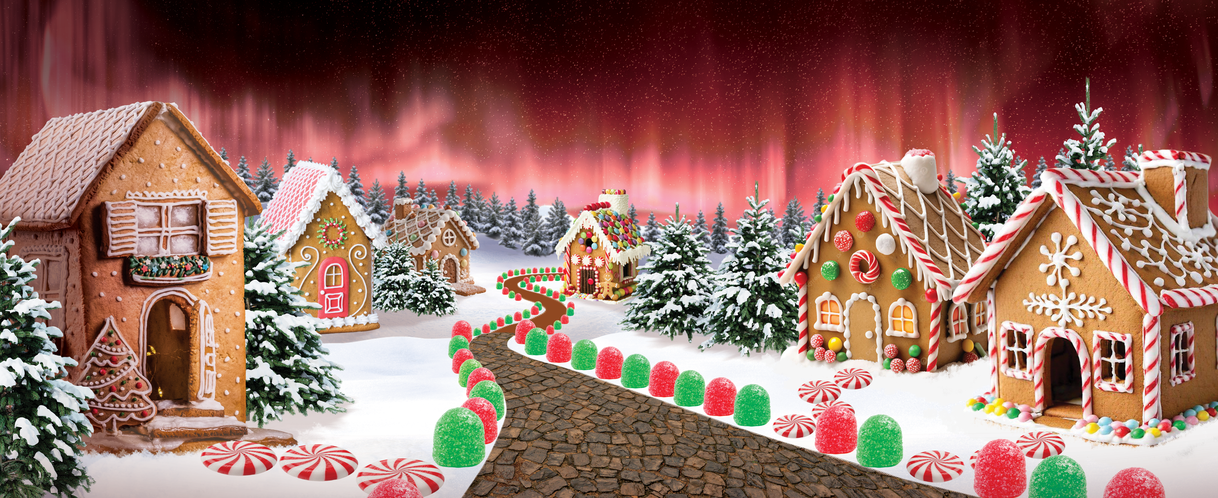
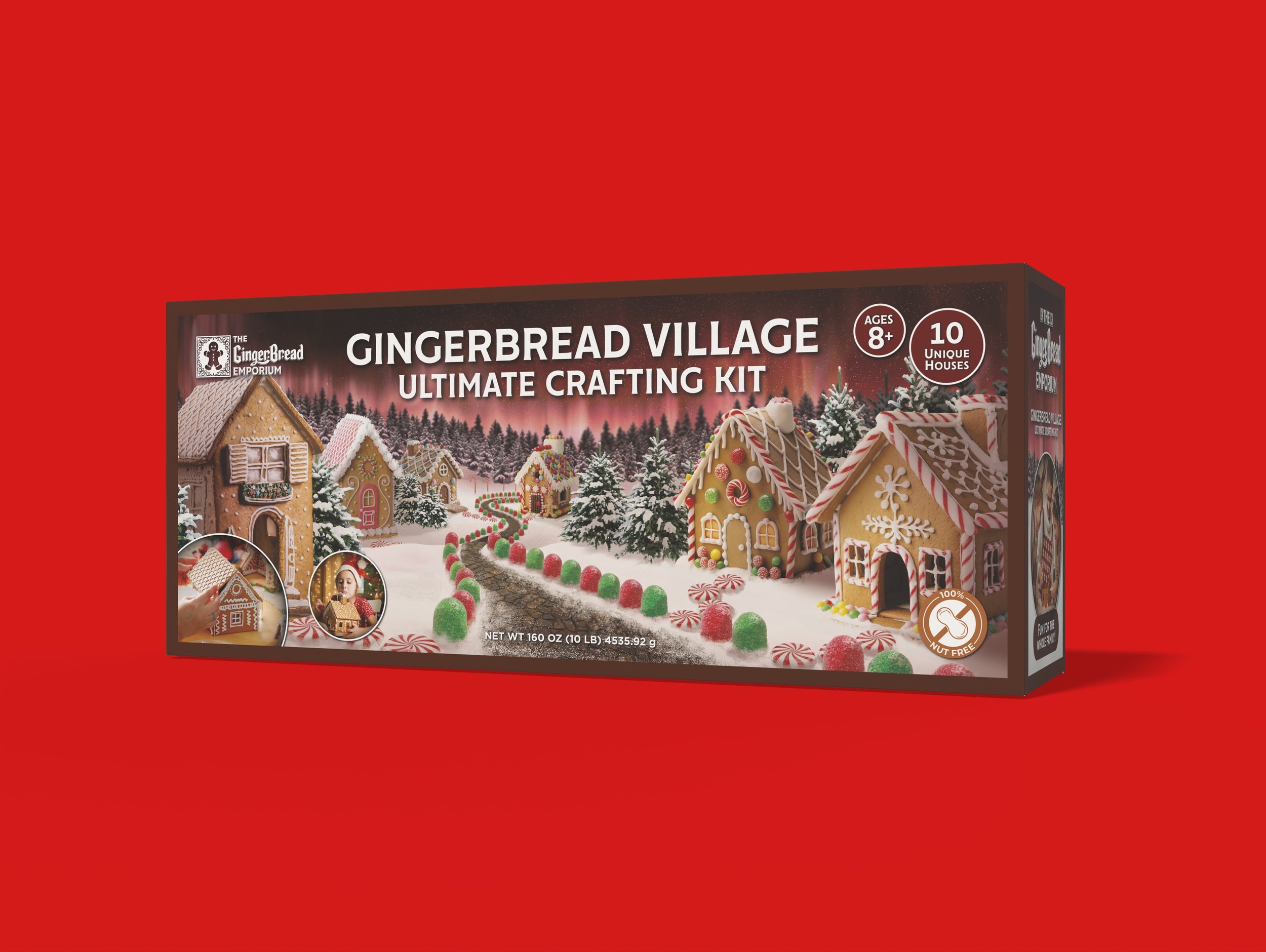
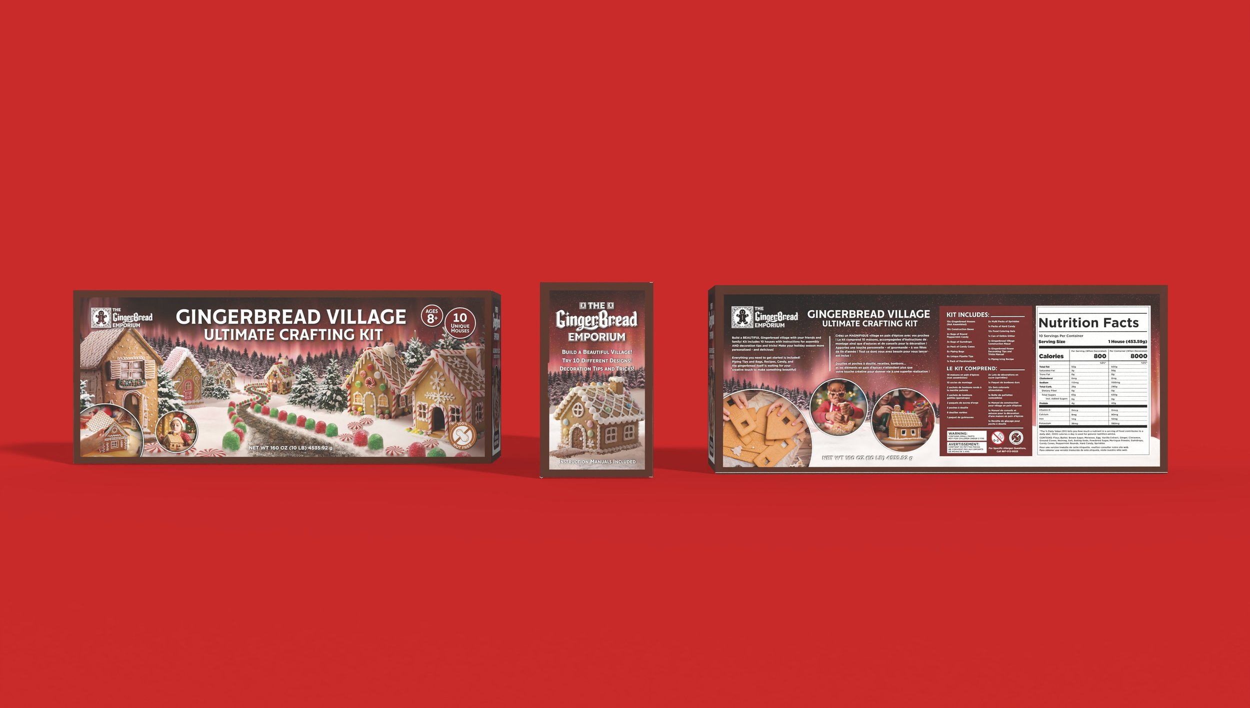
I began with the bigger kit, creating a general concept design for the front panel, the primary selling point for the kit and thus the most important part of the entire box, and refining it to create an immersive, detailed scene to highlight the multiple houses included in the kit, involving heavy photoshop editing and painting.
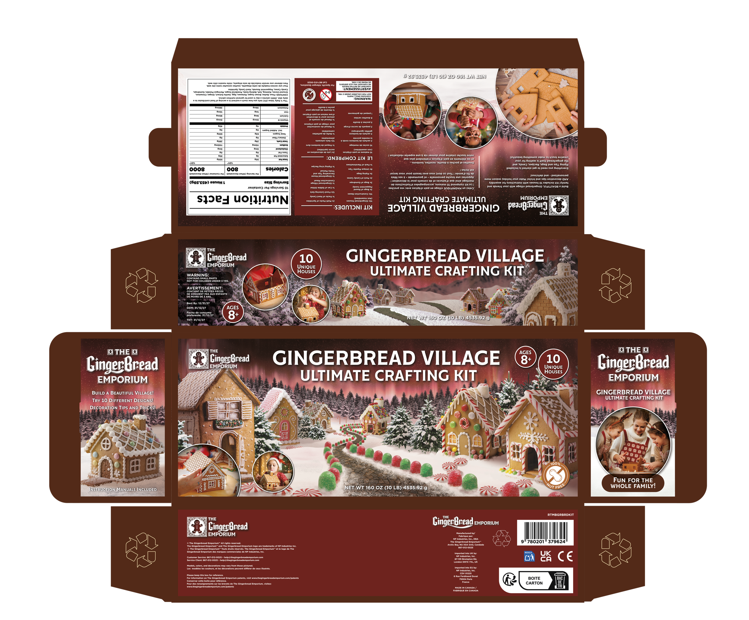
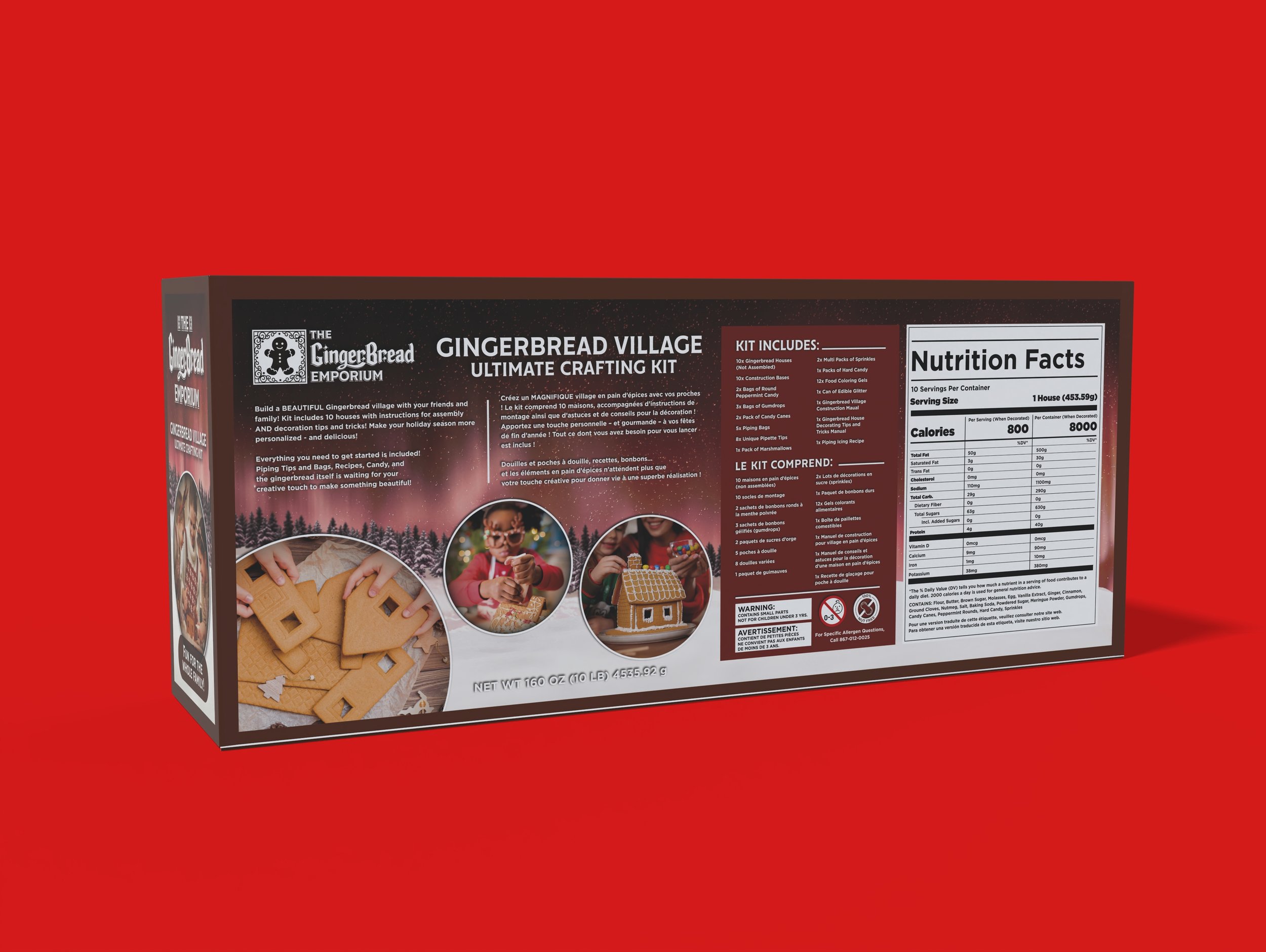
The die-line below the results after heavily adjusting, painting, and editing the layout in photoshop for all panels, highlighting all necessary legal information, adding nutritional values and facts, photos highlighting user results, and callouts about the kit’s features.
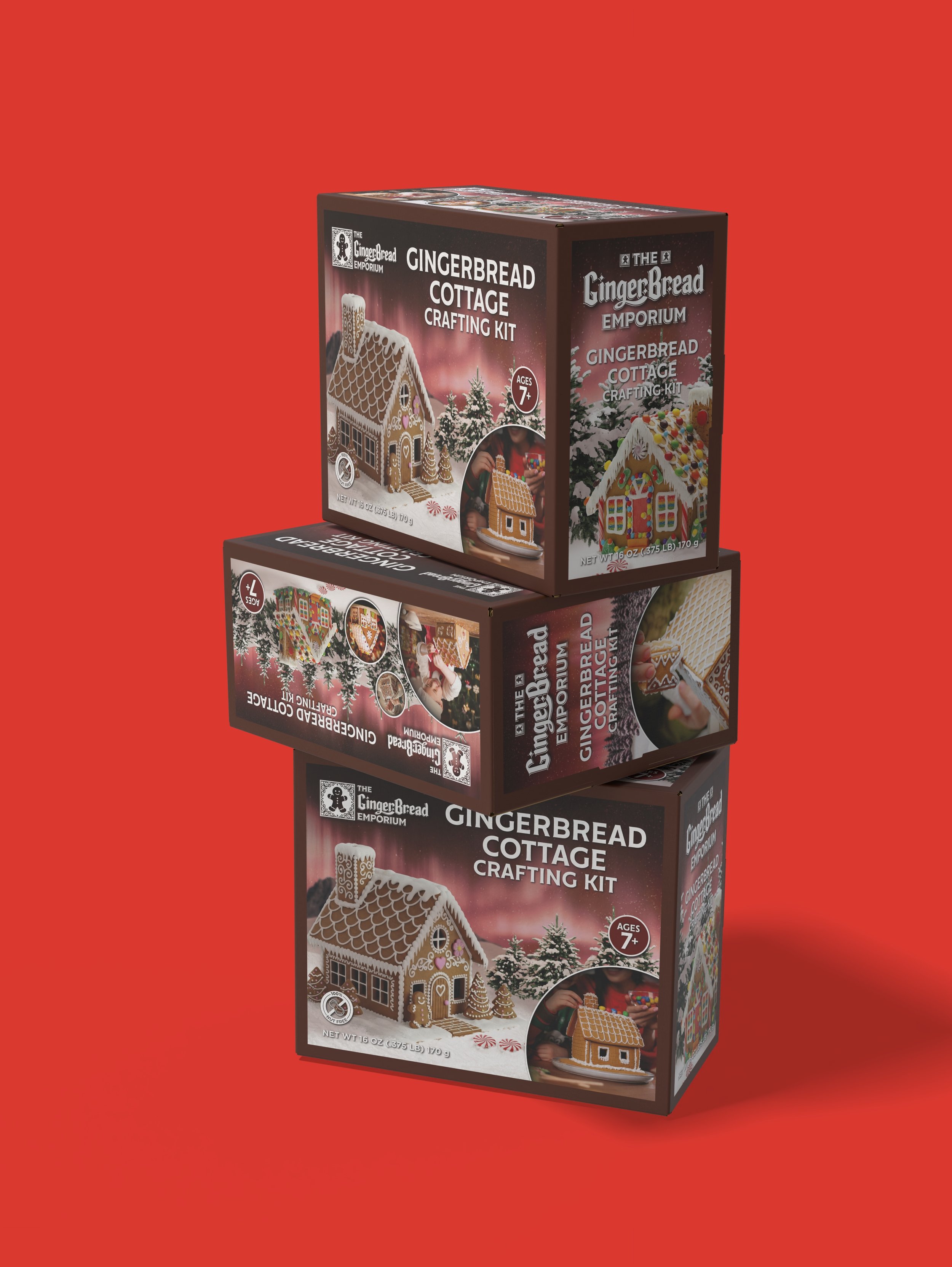
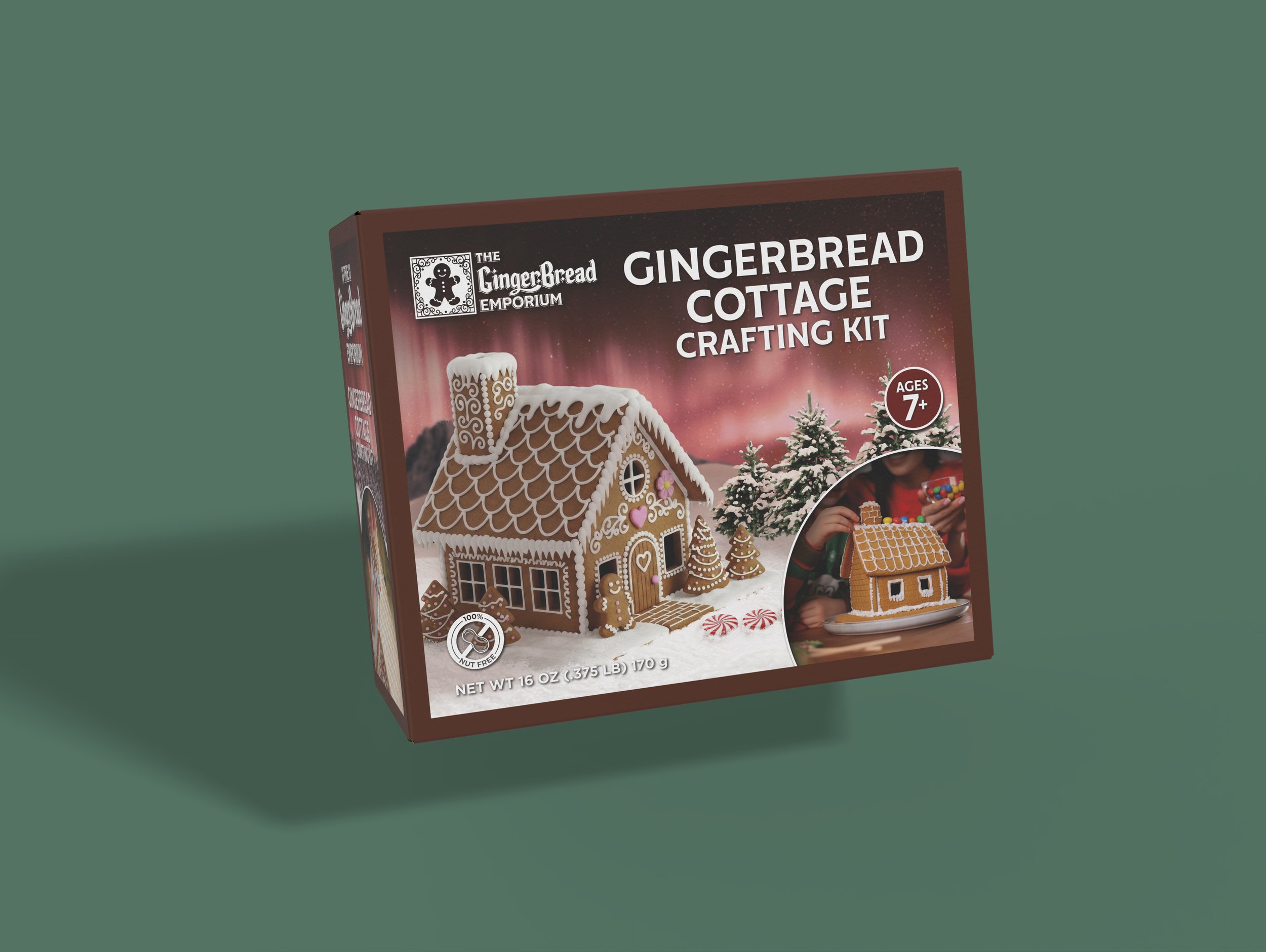
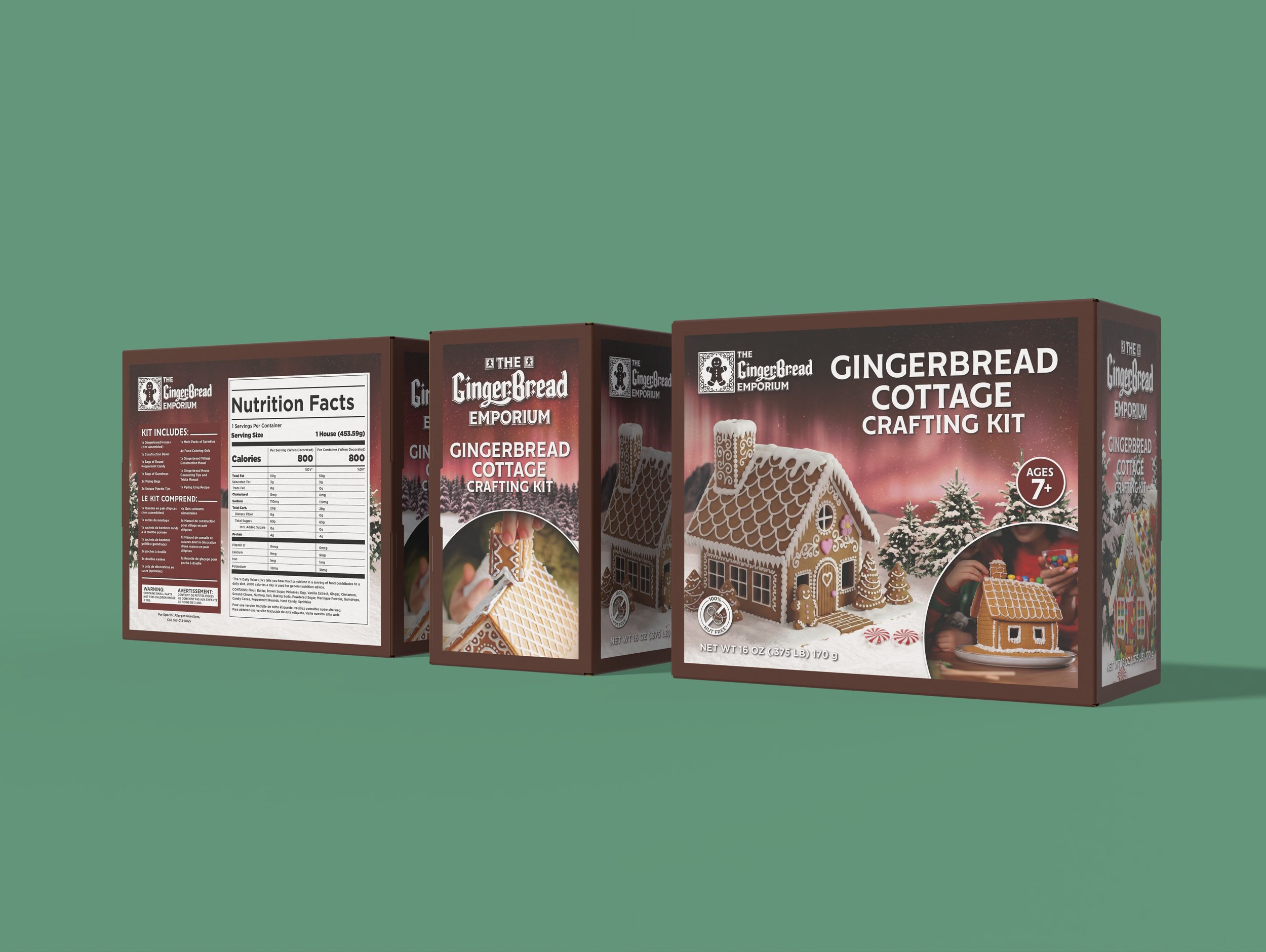
This packaging visual identity was then applied to the smaller, single gingerbread house kit, with mockups of both being created for advertising purposes.
Find, Follow, or Contact Me
email: info@abigaillynn.art
You can find me @abigaillynnarts on the following social media / ecommerce platforms